You Don't Need A Bar Graph
This past week was full of research. Researching internships in the West Coast. Researching rents in Seattle and San Francisco. Expensive. What did I expect? Researching the best methods to get my résumé past the Applicant Tracking System. Unsurprisingly, all you need to do is fill it with buzzwords and technical jargon.
Over the weekend, I finally got around to researching data for my project on climate change. I've been thinking of focusing on either intensifying desertification in North America or comparing energy use across different types of buildings in the US. Lately, I've been reading a lot on zoning laws and land-use regulation so I decided to look for data on the latter topic.
It's proving to be a difficult task to gather good, structured data on energy use in buildings, especially since most is kept private by construction and design firms. One company, Stantec Inc, does provide easy access to its studies and data, and they even visualize some of their results in a quarterly design magazine. Below is a visualization of energy use intensity (EUI) of a single building that is being redesigned:
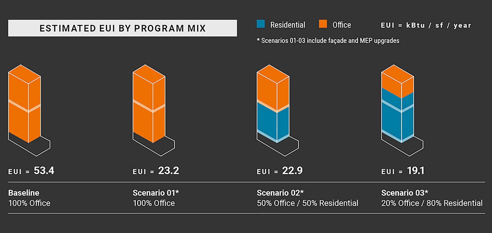
I happen to really like this graphic. This information could have easily been visualized using a bar graph, but this is a more appealing design. For something as dry as the amount of energy used by a building, this graphic manages to be playful and clean. The building itself almost looks like a lego piece. Rather than encoding the the energy use of the building with the length of the bar (or in this case building), the energy use is simply stated underneath each building, while the amount of space reserved for residential and office use is encoded in the height within the building and in the colors. This helps emphasize the point that mixed use buildings are more energy efficient.