The Infographic
The Infographic: A History of Data Graphics in News and Communications, written by Murray Dick, does exactly what it says in the title. Dick presents readers with a thorough history of data visualization and infographics as they developed through what he deems are four periods of British infographics culture. He offers thoughtful criticism and defense of the art, as well as a cautionary set of best practices and ethics.
Dick takes us back to the 1700s to look at two settings: the classroom and the the print house. We are first presented with a chart created by a history teacher named Joseph Priestly. His chart, titled A New Chart of History, is giant and visualizes the reign of different empires and civilizations across history.
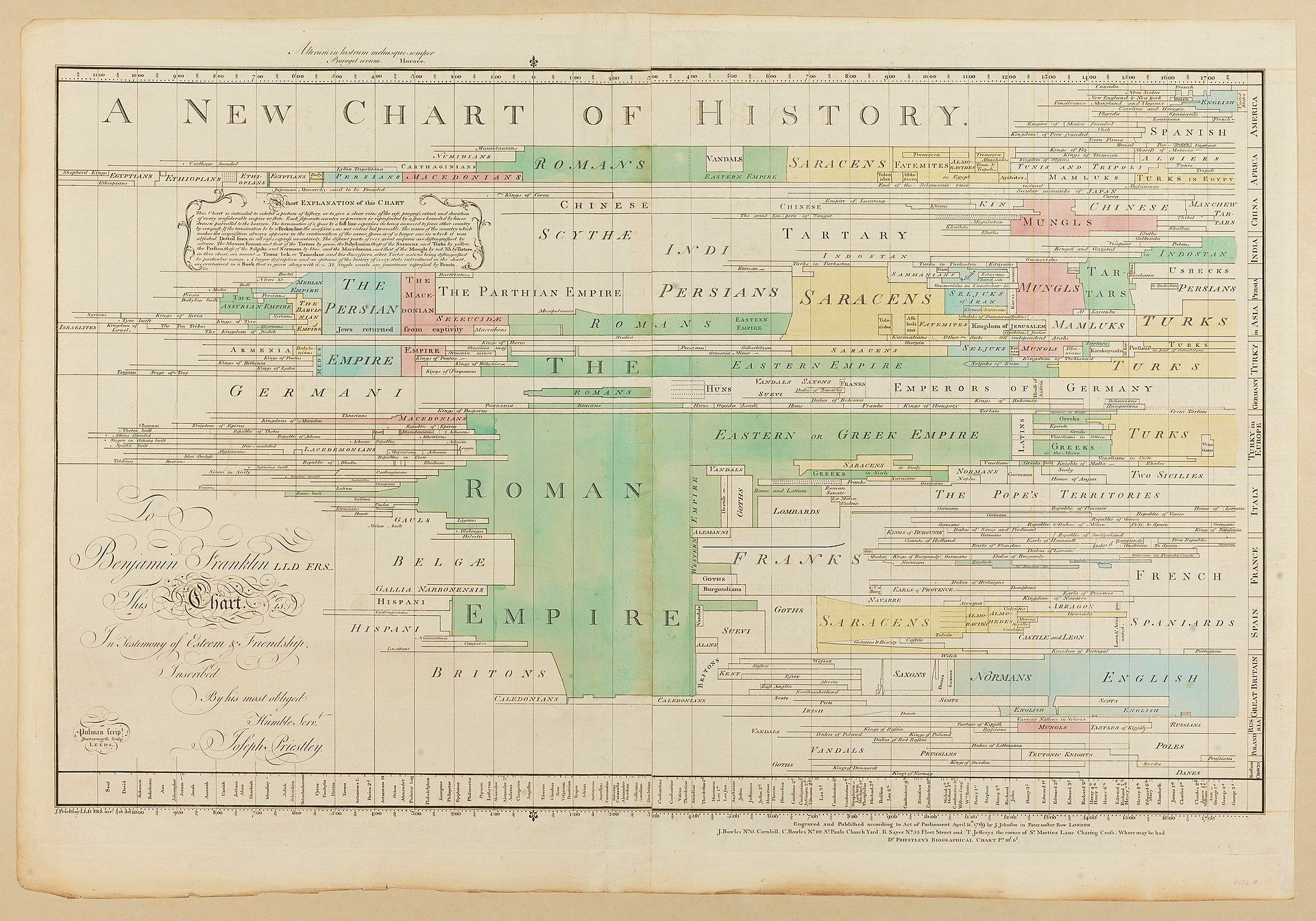
The chart is described as playful, but ultimately a means of creating discussion within the classroom amongst students and peers. It's large size (3' x 2') meant that its purpose was not to be reproduced for the masses, but something to be viewed within its particularly academic setting.
In the same century, Dick offers a different visualization by the economist William Playfair. Unlike Priestley's work, Playfair's intentions were to reach the "educated" masses (wealthy upper class readers) to persuade them in supporting certain economic policies. His infographics were meant to be published in journals and newspapers, but because of the high cost of production it was not commonplace to have these visualizations.
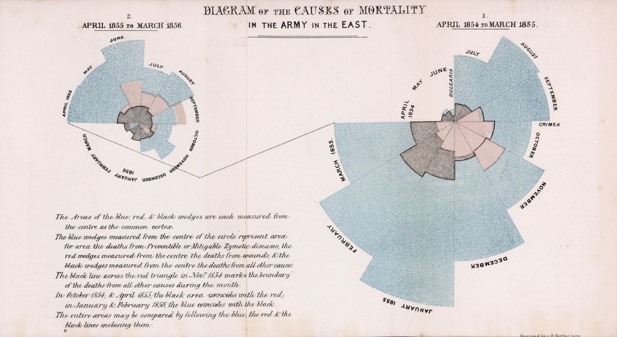
Dick continues into the early 1800s where infographics are mainly developed as a form of persuading policymakers. In this regard the purpose of the visualizations is similar to Playfair's. However, unlike Playfair, these visualizations were not meant to perused by the public, so they weren't published in a newspaper. Among some charts presented is one of my favorites visualizations: Florence Nightingale's Diagram of the Causes of Mortality in the Army in the East.
As technology and the culture surrounding it got more advanced, infographics started to be published with more frequency to the point where we are today. Unlike its early start where infographics were meant to persuade people in positions of influence, infographics are now meant to be consumed by the general masses.
While giving the reader a lecture on the history and development of the infographic, Dick also takes a stance that counters the Tuftian logic of visualization. While Tufte argues for clean and minimal charts with scientific precision, Dick argues that the elements Tufte considers "chartjunk" has a place in communication, especially with regards to the masses who may not have the necessary scientific and mathematical background to fully understand statistical charts. The bloated elements that Tufte rejects creates an easy visual language that can be understood by most people, and therefore can help communicate ideas between journalists and their audience.