Data Visualization Handbook
Data Visualization Handbook, written by Juuso Koponen and Jonatan Hildén, is an excellent introduction to the field of data visualization. The book is rich in detail and explanations, both written and visual, and could serve as a quick reference guide for even the most seasoned data visualization expert. There are plenty of "rules" and "guidelines" provided by the authors, but through numerous examples they make it clear that these rules are not written in stone. Rather, they provide structure for those that are just entering the field, and a launch pad for more experimentation for those that are willing to deviate from the best practices.
The book is divided into six parts, beginning with a small introduction to data visualization. Koponen and Hildén familiarize the reader with common language used to describe visual design and the purpose of visualizing information. In the words of William Playfair:
"Visual presentation gives a simple, accurate, and permanent idea, by giving form and shape to a number of separate ideas, which are otherwise abstract and unconnected."
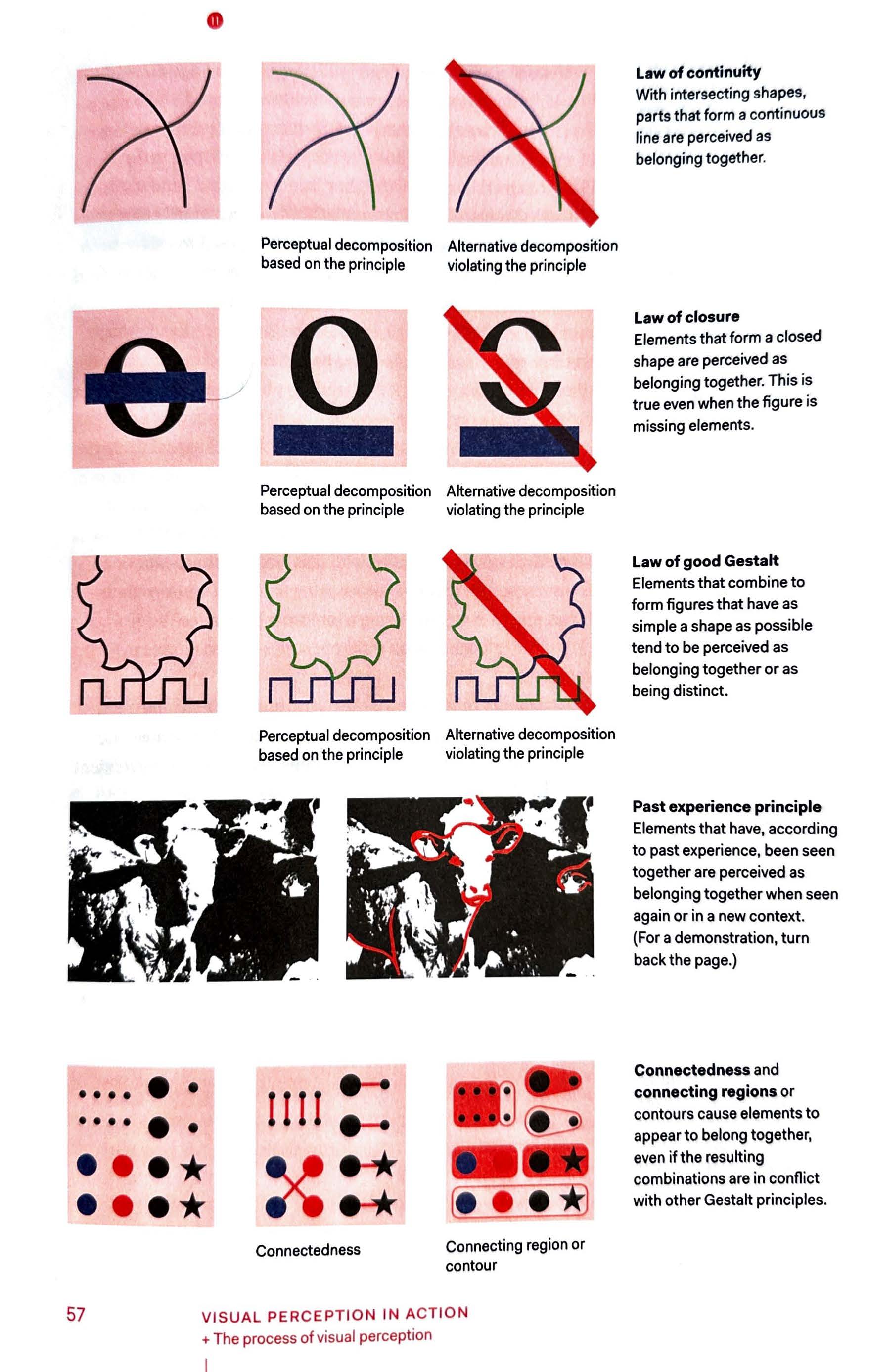
The second and third part of the book lays out a logical framework for readers to understand the principles of visual design. Reinforced by studies done by Colin Ware and others, Koponen and Hildén explain the psychology behind perception, which informs our choices when creating good designs. They go in-depth on how our brains unconsciously process the most basics features including color, shapes, curves, and size, and this knowledge can be used to guide readers across designs and get them to draw the intended conclusions.
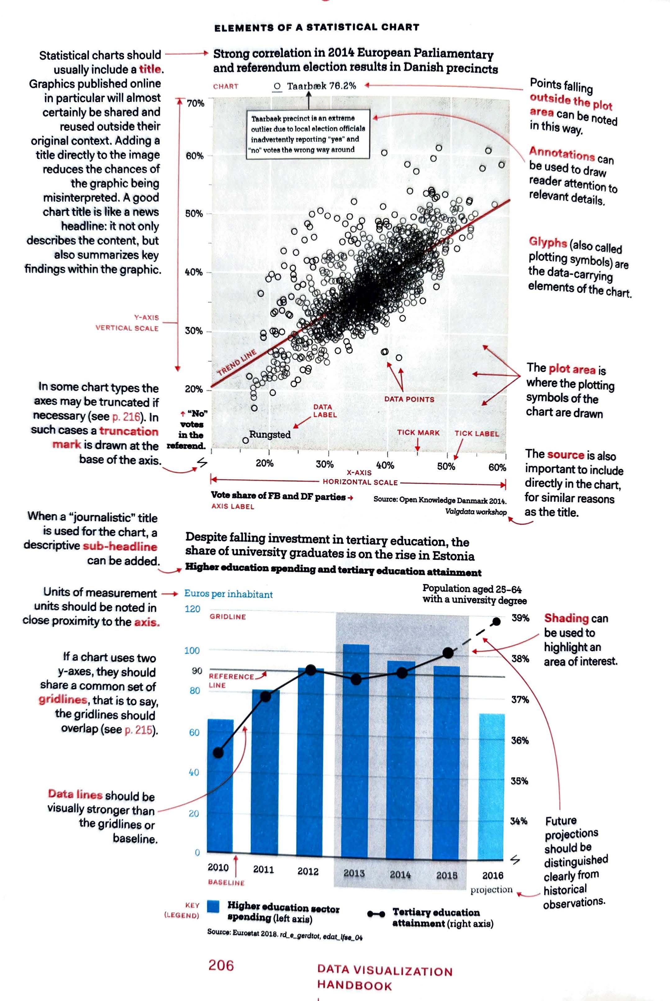
The fourth part of the book, Information Design Genres, is the largest section. This is the portion of the book that acts as a true handbook, containing hundreds of examples of different types of visual designs. This part of the book presents six different types of designs: Information Illustration, Maps, Statistical Graphs, Concept Graphics, Network Diagrams, and Scientific Visualizations. Each section is filled with examples and specific designs for conveying different types of information. This part of the book focuses less on what not to do and rather how the charts are used to give visual meaning to data. The examples are also presented with a generous amount of notes on standard ways to layout information on the charts.
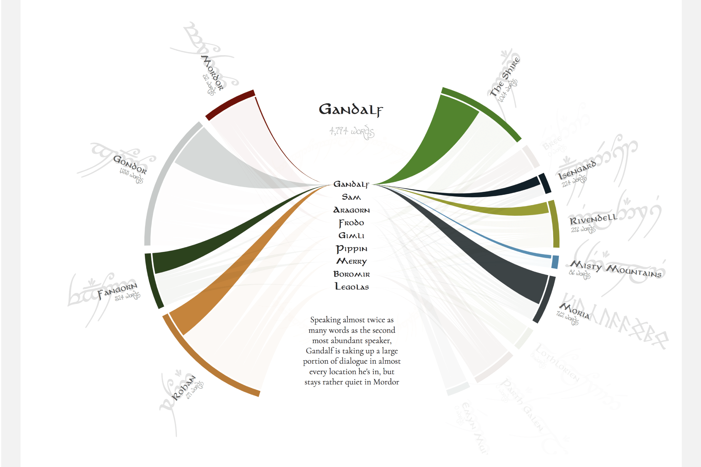
This section also has what is probably my favorite graph in the entire book: A chord diagram showing how much characters have spoken in Lord of the Rings, created by Nadieh Bremer.
The fifth part of the book, Text and Typography, feels like a natural, but often overlooked, progression. Now that Koponen and Hildén have thoroughly provided readers with chart options, the authors take an in-depth look at how text and typography affects our ability to perceive information. Just as in the previous part of the book, the authors also present typography with respect to maps, including what typefaces to use for different map scales.
The final part of the book sees the authors discuss the work flow and structure of data visualization alongside journalists. Within these organizations, there is a strict separation of duties from the journalists and the graphic designers, but the authors argue that graphic designers should have enough respect to work directly as journalists. Finally, the book ends with a discussion on the ethics of data visualization and a set of guidelines for visual journalists and journalists alike.
This is an extremely thorough and detailed book, without getting bogged down by technical jargon. The plethora of visual examples gives readers plenty of tools to use this book as a guide and get started on their own projects. I highly recommend this book for anyone who is interested in data visualization, beginner or expert.