Misleading Trend Lines
For as long as I can remember, each year of my life has been broken into semester long units of time with breaks in-between. As a life-long learner, breaks give me a gentle space to reflect and complete tasks that have sat on my To-Do list too long.
Finish reading Collected Fictions by Jorge Luis Borges. Check.
Build and install a trellis on the balcony. Check.
Start running again. Begrudgingly...Check.
With those things out of the way I began reviewing my notes from the previous semester and came upon an interesting set of data. Below is a graph of average fall and winter temperatures in Fort Collins, CO between 1900 and 2010.
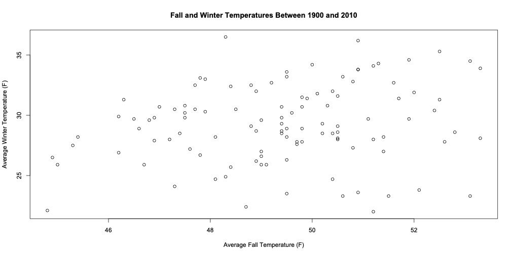
If you look at the data long enough, you might convince yourself that there MUST be a trend. Higher average temperatures in the fall surely must result in higher average temperatures in the winter. Eager to report your findings, you use your software of choice and add a "line-of-best fit"; you didn't understand what it meant in your high school science lab, but surely this must be an appropriate use.
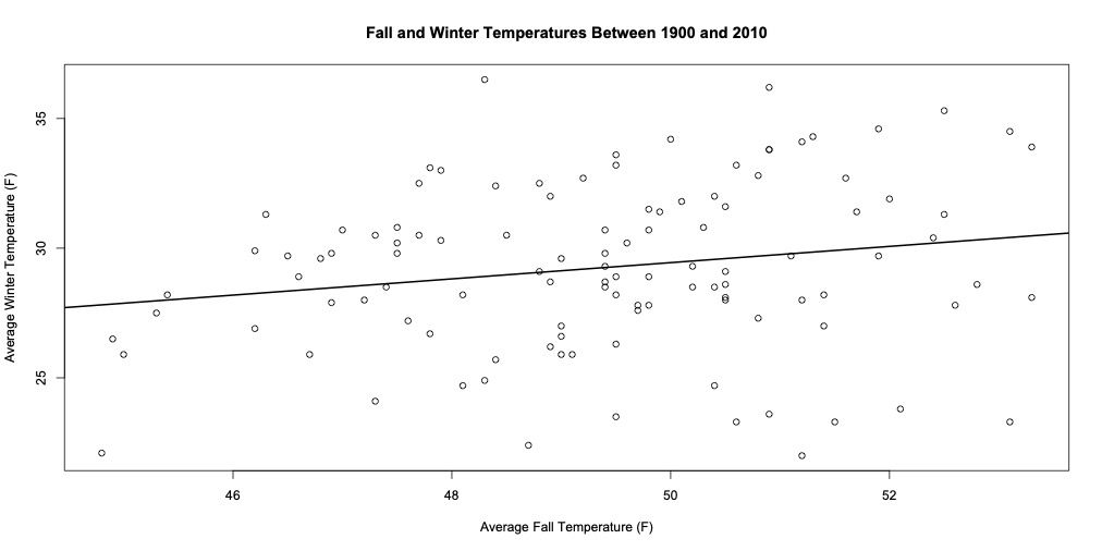
The line is definitive proof that the trend exists. It validates your suspicions and guides your audience to see the same trend that only your discerning eyes could make out.
Unknowingly, you have misled yourself, and more importantly, you have misled the readers. While it is true that this IS the line-of-best fit, it is NOT true that this model is valid. For one, it's impossible to reduce climate models to a single variable. But even if you feel determined to find a correlation between these two variables, a quick statistical analysis reveals that this model can only explain 4% of the variability. In other words, we don't really know why the data is so spread out when we only consider fall temperatures. The model is a poor predictor.
Misrepresentation of information happens when we let our biases get the best of us. Misrepresentation of information happens when we force the data to fit our views.
When I was a physics teacher, I would have my students perform experiments and figure out the model (equation) from the data. Sometimes, certain groups collected data that could not possibly result in an accurate model and yet, somehow, they would experimentally confirm these models that were derived in the 18th century. They were misrepresenting their data.
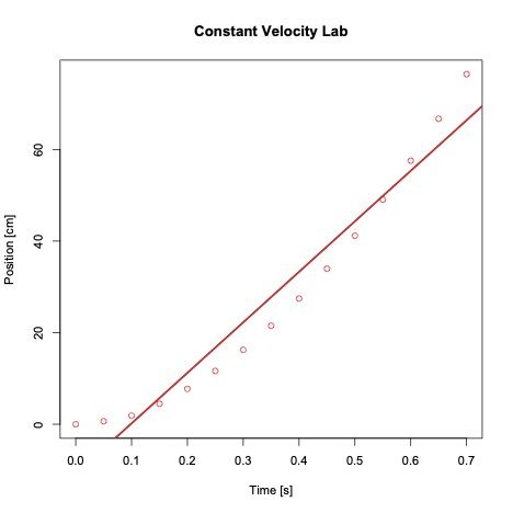
The graphs I've shown are far from beautiful, but at its core they all try to do the same thing: visually engage the audience and communicate trends.
They also lie.