Making of Miami SoundScape
This was a semester long project for the Data Visualization Studio course at the University of Miami. At the beginning of the term, we were instructed to pick a topic and create a visual story. Open ended instructions like these always give me a hard time because the possibilities feel endless. My mind instantly thought about expanding on a previous project on voting, but the prospect didn’t make me excited. Then, I thought I could focus on basketball. But every season it feels like there are more than a dozen stories being developed. So, again, I felt a bit of decision paralysis.
The idea of sound didn’t come to me until one day I was reading about a particularly quiet area in Olympic National Park. It got me thinking of all the possibilities around sound, until it finally clicked. I would develop a story on sounds in Miami. At that moment, I decided that I would learn D3 to add interactivity to the graphs. Ultimately, the graphs were all generated in R, stylized in Illustrator, and pushed to Github using ai2html.
Collecting Data
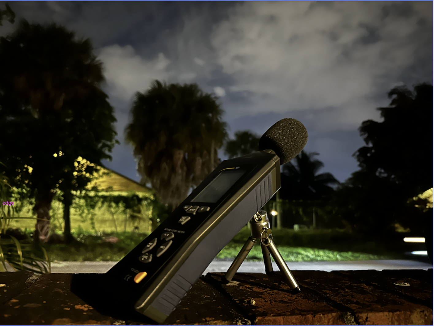
The data collection process was by far the most time consuming aspect of the project. Miami, and Miami-Dade County for that matter, does not have a single piece of publicly available data on sound intensity. The last study was conducted in 2011 by the Florida Department of Transportation, and the outdated data is held onto tightly. Given the circumstances, I decided to purchase a Sound Meter from PCE Americas. The sound meter is capable of recording the intensity of sound with the push of a button.
Initially, I was only going to record data at 11:00 AM, but I decided to record during rush hour at 5:00 PM and in the late night at 2:00 AM. Each recording was about 10 minutes long, and it took approimately 8 weeks to get all the data. I had greatly underestimated the time it would take to collect that much data across 23 neighborhoods.
Preprocessing Data
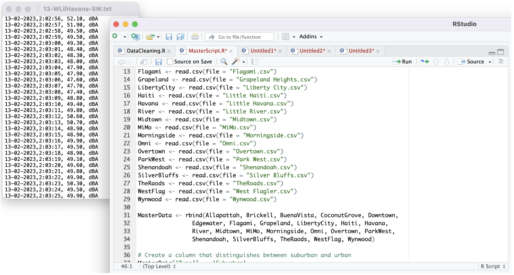
Unfortunately, collecting the data was not the only time consuming part. The meter is able to store the data directly, but the only way to extract it was by uploading it to a Windows PC. I have a Mac. Thankfully, a good friend was kind enough to lend me his laptop to retrieve the files. The data came as a text file and the values were uploaded to R. This allowed me to extract the relevent features and structure them by neighborhood and type of neighborhood (urban/suburban). The files were then aggregated based on the neighborhood so that the data would reflect all three time slots.
Jumping Into D3
At the same time that I was collecting data I was also taking the time to learn D3. After having the full dataset and learning D3 for over a month, I thought it would finally be time to put my abilities to the test. I began by creating a density curve function and graphing the distribution of sound in a single neighborhood.
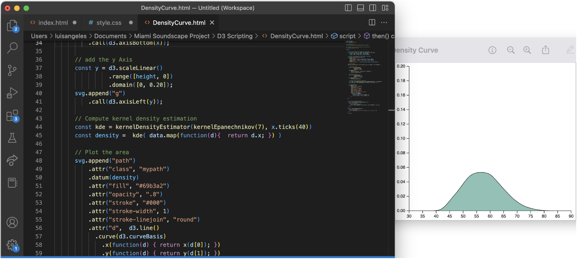
I was...underwhelmed to say the least. It was 78 lines of code to generate a completely static graph. D3 has the capability to stylze graphs, but even styling a basic graph like this one required a greater familiarity witht the library than I had at that moment.
Nonetheless, I read through a treasure trove of documentation and looked at examples on the web. But I couldn’t find answers to my problem. I kept tinkering around and exploring different ways of comparing the distributions of each neighborhood. I knew having filled curves would make it difficult to distinguish neighborhoods from one another, so I removed the fill color and placed the curves for all the neighborhoods on the same axis. I even tried adding a map of the area.
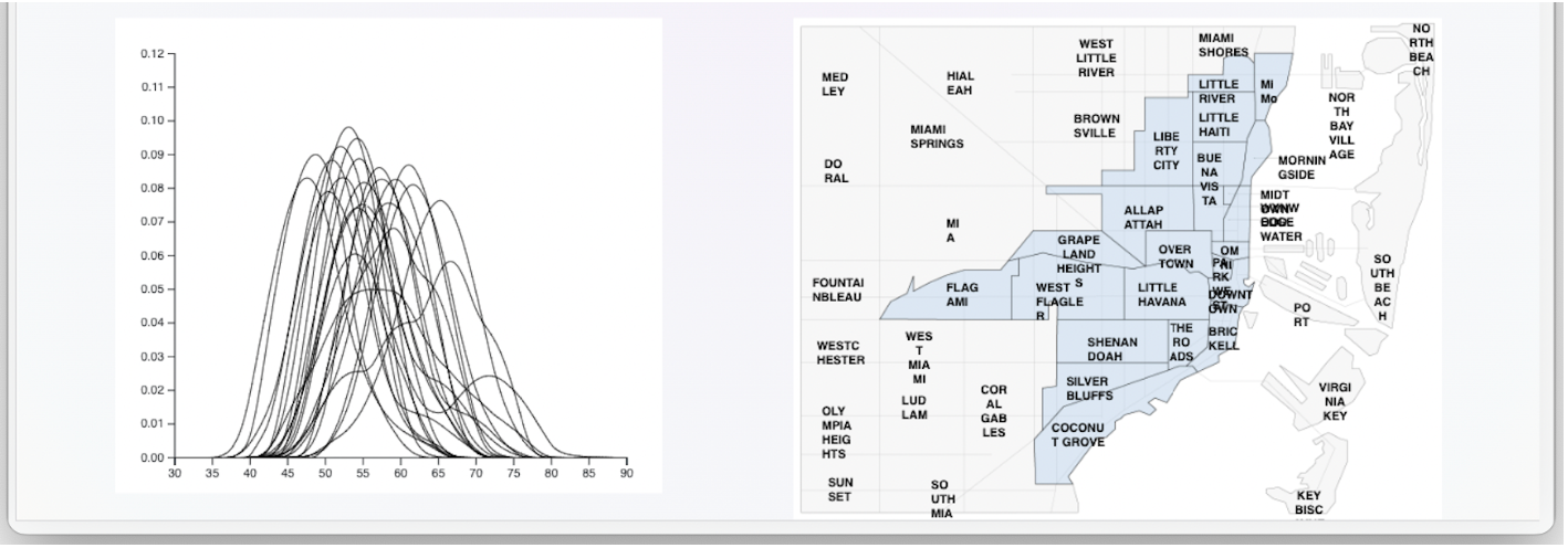
It became immediately evident that no amount of highlighting or transparency would make it easier to distinguish one line from the rest. There was also an issue with the text on the map and despite my hardest efforts, I couldn’t fix any of my issues. At this point the deadline was approaching fast and I began to sink into despair. I talk about it in a previous blog post.
Back to Basics
At this point it felt like everything that could go wrong was going wrong. Not only was I having issues with D3, but my I couldn’t get my CSS grid style to align properly and my responsive media queries were creating issues with text wrapping. I really felt like there was no getting out of this, but thanks to some words of encouragement from my professor, Alberto Cairo, I was able to clear my mind and start again with an empty canvas. Instead of focusing on D3 and all the coding issues, I started to draft up static graphs and complete the structure of my story. It was almost as if a switch had flipped and I knew exactly what I needed to do.
I knew that my main goal was to point out the difference in sound intensity across the neighborhoods of Miami. Initially, density curves seemed like a good idea because that is their purpose: to visualize the distribution of the data. But having so many on top of each other made it impossible to get a clear picture. The graphs themselves were also boring and perhaps thematically disjointed. The question was then “How can I visually present the distributions in a way that neighborhoods are unique and fit the theme of SOUND?” Enter the longitudinal wave.
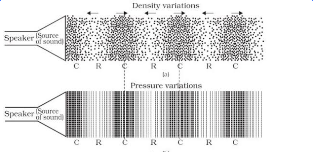
Going back to my background in physics, I remembered that sound is just a longitudinal wave. That means that sound is a collection of particles that move in the same direction as the sound wave itself. More simply, if a speaker shoots sound forward, then the air particles must be moving forward. While they move the density of the particles compresses and stretches, almost like a slinky. From a design perspective this solved my two issues! It could represent the density of the recorded sound intensities and it fit the overall theme of sound. This led me to create two elements for the project:
The section divider:

And the base sound distribution:
The distance between the lines in the section divider was calculated using a sine function. Then, I repeated the pattern until it had the appearance of a longitudinal wave.
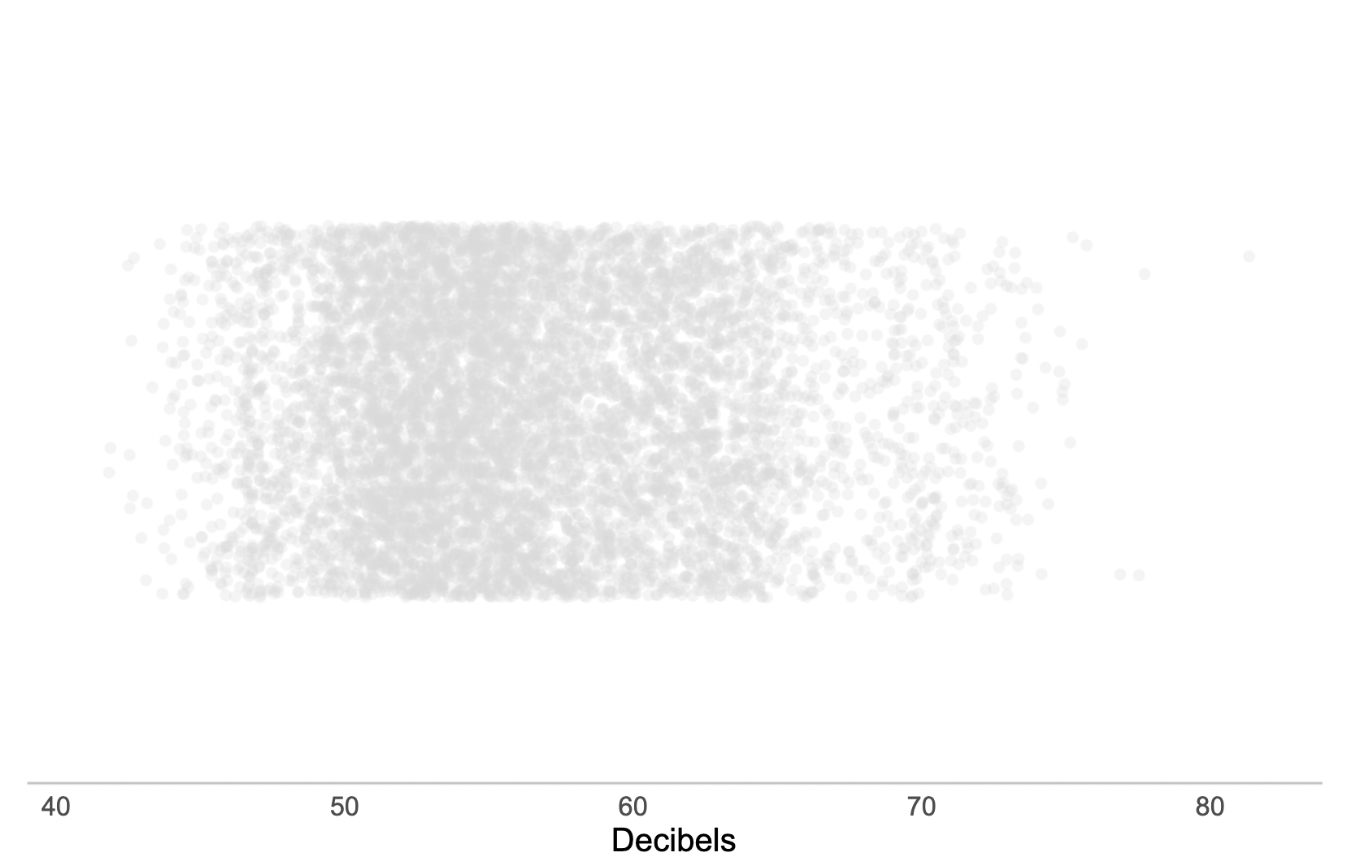
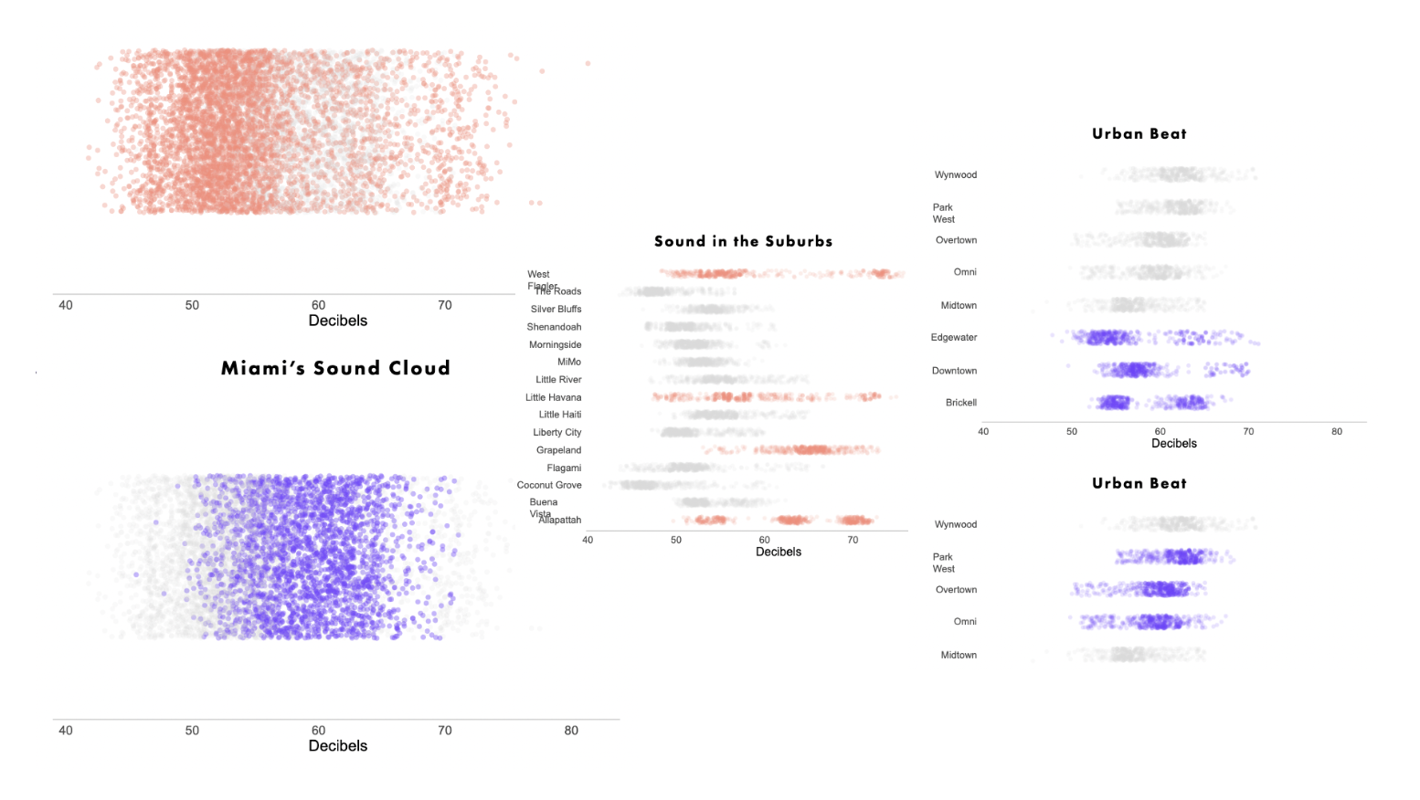
The base graph was created using the stripchart function in ggplot and adding jitter to make the position of the dots more random, similar to a longitudinal wave. However, rather than representing motion, the graph represents the density of all recorded observations. Dots further right indicate louder observations and dots further left indicate quieter observations. Areas that are darker mean there is a greater concentration of sound observed at that decibel level.
Putting It All Together
With the design down, all that was left to do was structure my story and show the differences between neighborhoods. I thought that the structure would be most interesting by starting from the most broad persepective (the city) and narrowing it down to individual neighborhoods. By highlighting the difference between interurban areas and the neighborhoods within these areas, the audience can get a more complete understanding of the sound intensity in Miami.
Reflections & Future Improvements
The biggest lesson I learned throughout the project was not to take the skill of time management for granted. I really underestimated how much time it would take to collect the data, in part because of how many trials I ended up running. Visiting one spot and recording data once is not likely to produce accurate results. The more records are collected, the closer your overall observation gets to the true distribution.
This semester was also a hard lesson in learning how to ask for help. I don’t normally have issues asking questions and collaborating with others, but there’s something about academia that always rbings out that “I can figure it out” mentality in me. And perhaps it’s true, I might eventually figure out how to properly with D3 and how to fix the issues I was having with CSS in the original code. But I should have reached out earlier for help.
This isn’t the end of this project, rather it’s the beginning of a new phase. There are plenty of ideas that I have to make this project more dynamic and alive, like including scrollytelling elements so that all the graphs and highlights arent presented at the same time, and using D3 to highlight or even annotate particularly interesting features. Similar to The Pudding’s “Sounds of CDMX”, I also want to allow users to choose between the guided story I present or exploring the sounds intensities of Miami for themselves. Both of these ideas require a decent understanding of Javascript and libraries like D3, scrollama, and possibly Mapbox.
I’d like to acknowledge and thank a few people:
Alberto Cairo for his mentorship, guidance, and thorough feedback. He also helped me get out of the dark swamp of despair and progress on my project.
My partner, Ashley, who kept me company while I recorded data and reminded me to eat when I was overwhelmed with work.
Finally, I’d like to thank my classmates Carolina, William, and Daniela for always being encouraging and offering great advice throughout the semester.