Cleaning Data
When I first began researching a career in data science and visualization I thought about all the higher level statistics that I would need to learn. I thought the bulk of my work would consist of developing and testing models, working with machine learning algorithms, and interpreting results. I never could have imagined that in reality the largest time sink would be in cleaning and preprocessing data. In most classes, the data presented is already cleaned or needs very minor cleaning. However, as I've been working on my own projects I've come to truly understand that data is often unorganized, messy, and unstructured.
At the moment I am working on a project that maps the noise pollution across the city of Miami. There was no available data online save for an outdated FDOT study that looked at noise along major arteries in Southwest Miami-Dade county. So I had to undertake the collection of the data by myself using a sound meter in over 400 locations at three different times in the day over the course of a month. That might sound tedious, but honestly it was a lovely gift to be able to intimately learn something new about the city I call home. The tedium is not in collecting the data, rather, it comes in everything after.
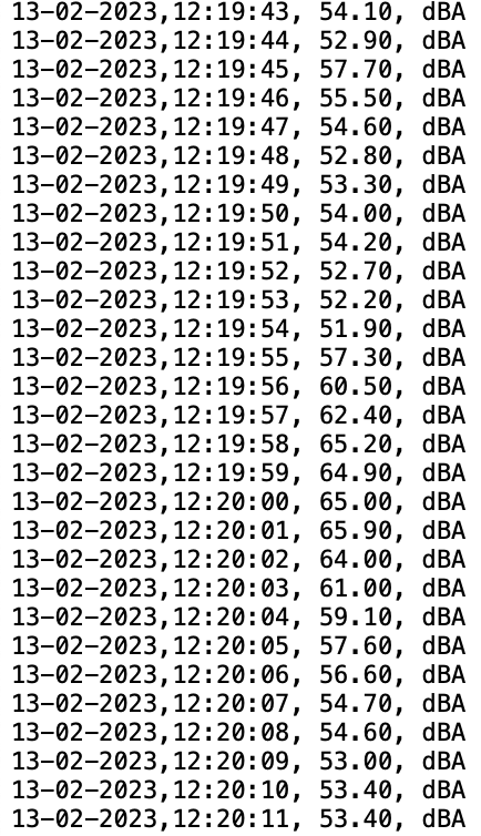
The sound meter records 4 pieces of information: the date, the time, the decibel reading at that moment in time, and the unit of measurement. I find that last piece of information particularly amusing because the sound meter cannot measure in any units other than dBA. As presented the data is not sufficiently useful. Moreover, this is just one recording at the given location. A single recording is not enough to accurately capture the noise in that area. Before I could begin to visualize my data, I needed to create a better structure.
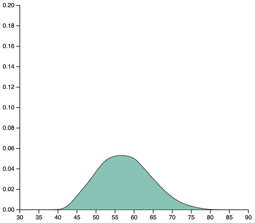
I intend on visualizing noise pollution as a distribution of recorded sound. The graph above is one of the many density curves I generated after cleaning my data. It was a big step forward and I thought I was finished cleaning. But as I began working with D3.js to visualize and report on the data, I realized that having a script to generate many individual graphs and store them as individual interactive objects is way more time consuming and inefficient than having the graphs generated when necessary. So for now I will be cleaning and restructuring my data, again.